Website pathing: What is it, and why is it important?

Georgina Guthrie
October 08, 2021
Most website owners want their visitors to do something — whether that’s to buy, sign up, subscribe, share, or book an appointment. If your customers do that, then congrats! You’re doing things right. But if they’re not, or you’d like your conversion rates to look a bit healthier than they are, it could be a sign you have problems brewing. This is where website pathing comes to the rescue…
Setting up a website to be optimized for conversions can feel complicated. There are tools to use, strategies to plan, and questions to answer. In the midst of all this complexity, it’s easy to forget that there are fundamental actions you can take to help ensure your website is giving the best experience possible.
One of these simple actions is called “website pathing.” By thinking ahead, you can discover ways to improve customer conversions through step by step marketing executed on your site. It’s incredibly useful, and, while it does take a bit of time to do, it remains popular because it works.
In this article, we’re going to take a closer look at what website pathing is, why it’s important, and how to get started. Read on!
What are conversions?
First, a quick word on conversions.
Conversions are events that occur on a website. Typically, this means turning a browser into a lead, signing up for an email newsletter, or purchasing a product. Conversions are split into two types: micro-conversions and macro-conversions.
Micro-conversions are smaller, low-value actions that help the customer. For example, these might include downloading a product brochure or signing up for your newsletter. Macro-conversions are bigger, high-value conversions with more of an impact on your business. These might include purchasing a product or making a donation.
Both matter for your business: Micro-conversions are what guide your customers through your marketing funnel and toward the bigger prize: a macro-conversion.
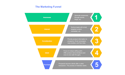
A typical marketing funnel, created using Cacoo
Here’s a typical journey a user may take:
- Customer sees one of your paid search ads on social media
- They click and land on an optimized landing page
- They’ll sign up for your newsletter
- They see an email featuring the item they want
- They return to your site
- Then, they add the item to their cart and leave
- They receive a reminder email featuring a discount for new customers
- Return to site and purchase
What does website pathing have to do with conversions?
In short: everything. Website pathing is the process of strategically managing what happens on your site’s pages, depending on how people interact with them. By using the power of website pathing, you can increase your conversion rate. But… How?
Here’s how it works: People who land on your page want something from you. Your job is to figure out what that is and make sure they get it. You can do this by creating a different ‘path’ for each scenario — from the amount of time someone spends on a page to whether or not they added an item to their cart — and responding accordingly.
The five elements of website pathing
A website pathing map consists of five elements. When you create paths for each element, your page will be able to intuitively respond to the unique needs of each person who visits it. Here are the five elements:
- A call-to-action (CTA) button. This takes visitors to your offer.
- A landing page. This is where people ‘enter’ your conversion funnel. It typically includes some information about your offer and a form.
- A form. Visitors fill this out with information in order to receive your offer.
- A thank-you page. This lets your lead know their form has successfully sent.
- A confirmation email. This tells your lead their details have been saved and gives them an easy way to reference the offer details.
Skipping one or more of these elements usually leads to loss of leads, lots of unsuitable leads, or poor user experience — which could mean your customer service team works harder than they should. So it pays to get it right.
Let’s take a closer look at what each of these stages involves.
Call-to-action
A CTA is a button that takes users to your offer. It can sit in a newsletter, on your website, on social media, or on a PPC ad. You want a simple button that’s noticeable and makes sense.
It should be written in a clear, easy-to-understand way — not too long or complicated. It should also be clear about where it’s taking the user. A button reading ‘Get a Quote’ should take a user to your quote request form or a phone number — not another website or a product page.
The main goal for CTA is to make it clear what you want users to do next. However, this can be done in the wrong way too — and push them away from conversion.
A bad example would be something like ‘Click Here.’ This doesn’t give users any kind of indication about what they’re going to click on, where it will take them, or why they should click. It’s just an invitation to click randomly without knowing where they’ll end up.
What makes a good CTA?
Effective CTAs are action-focused (‘call us,’ ‘get a quote,’ ‘explore the range,’ etc.) and are placed on the path leading to conversion. They are more prominent, they stand out better, there’s only one of them, and users know exactly what they’re looking at.
The takeaway: You need to have all of your marketing efforts focused on one goal — increase conversions. Having clear CTAs is essential in accomplishing this goal.
Landing page
This is where your user lands after clicking your CTA. It should be highly relevant to the page they were just on and focused on your CTA.
In the headline, you should make the offer clear (and tie it back to your CTA) — and get to the point quickly. Quirky text or puns have a place, and this is not it.
You should also include an image of your offer to make things visually appealing, plus put the form above the fold (so the visitor can figure out what they need to do without scrolling). Add bullet points or a short and snappy summary so they know what they’re signing up for.
The takeaway: Make sure your website’s pathing leads to a highly targeted landing page.
Form
A form is required on most landing pages. Don’t add a form, and you’re essentially giving something away without learning anything much about your visitor.
There are several different types of forms you can have depending on the action you want your user to take and the kind of information you want to collect about them. At a bare minimum, you need at least two fields within the form: One for their first name, and one for their email address. The rest of the boxes are optional and will depend on a couple of things:
- Is the user creating an account? Or is this for lead generation? If it’s for lead generation, you might only need their name, location, and email address. If it’s an account, you’ll probably need more data — including their billing details.
- How far along is your lead in their buying journey? If you’re giving them something small, like an infographic, their name and email will probably do. But if it’s something big, like an ebook or trial demo, that could mean they’re close to purchasing, and you might want to gather more info.
- Can you process everything you gather? If you have a small sales team and they’re struggling to sift through all this data, you might want to pare things back a bit and focus on the key questions that’ll help your team decide who’s worth contacting.
- Do you have enough space on your landing page? Remember to keep everything above the fold, and avoid overwhelming new visitors who might be put off by an endless form. Keep it short, and consider asking for more information later on.
Thank you page
It’s important to acknowledge your customer’s form submission. Not doing anything or sending them to your homepage is a bit disconcerting (hang on… did that work?!). Instead, send them to a thank you page. Think of the thank you page as being like a ‘virtual handshake’ with your customer, thanking them for filling out the form.
Don’t forget to let your customer know what will happen next after submitting their information — tell them about their form and how soon they’ll hear back from you via email or phone call.
Your thank you page should also include the offer, a follow-up offer, and be personalized.
It’s also a good place to add share buttons (free advertising!) and showcase testimonials. It’s important to provide social proof so customers can see that other people are using your product successfully to reassure themselves they’re making the right choice.
Confirmation email
The first thing you should do is thank your lead for signing up — people like to know that they’re appreciated. And make sure you address them by name.
You can also remind them of the offer and include links back to the thank you page and landing page. You can even put links to blog articles or videos about the product too.
Lastly, include more social proof here. By this point, you’ve probably built up enough credibility with your audience that you won’t have any problem including before and after testimonials or mentioning how many people are already using your service. Oh, and social media buttons don’t hurt either — a share or a follow is never a bad thing.
Final thoughts
Thinking about your website pathing is a must if you want conversions. However, don’t make the mistake of thinking that pathing is something you can do in a day — it takes time to figure out what your potential customers want, so be patient with yourself as you do this. Be ready to experiment with different content and calls to action, too.
Diagrams can be a really helpful way to show your paths and track your results. Why? Because diagrams are easier to take in quickly vs., say, loads of text. With Cacoo, our own diagramming tool, you can create marketing visuals, then share, view, and edit as you go along. Meaning that if you learn something new about your leads, your site, and the way they interact as the project goes on, all you need to do is update your diagram and carry on. Easy!

