What is information design, and why is it important?

Georgina Guthrie
May 07, 2021
We’re surrounded by information design every day. From train station maps to infographics, exhibitions to tutorials — it’s all around us. Yet, most of the time, we don’t give it a second thought, nor do we necessarily know how to pin it down. What counts and what doesn’t? And how is it different from other displays of information?
In this article, we’ll take a deep dive into the fascinating world of information design — then share some tips on how to get started on your own creation. Let’s get to it!
What is information design?
Information design is all about presenting information in a way that’s easy to understand. It’s a subsection of graphic design related specifically to displaying information effectively (and stylishly). It can include facts and figures, stories — even sound and scent — as part of its information-sharing capabilities.
What’s the difference between information design and data visualization?
Data and information — two words with similar meanings. According to the OED, information is ‘The imparting of knowledge in general.” Data, on the other hand, is defined as “facts and statistics collected together for reference or analysis.” So data is facts and figures, whereas information can be anything from statistics to a lecture, story, or graph.
Or, in other words: Information gives the viewer a message. Data gives the viewer raw material from which they can draw their own conclusions.
Data visualization could encompass graphs, timetables, and charts that evolve as more information is added. It could be the Kanban board you use to keep jobs on track, a speedometer, or a price list. Information design encompasses graphics such as infographics (which in themselves can include data visualization) and any other tool that leads the viewer toward a bite-sized conclusion.
Types of information design
Information design is all about combining bits of information and data so it makes sense to the reader. It’s an incredibly broad umbrella — let’s take a closer look at some examples.
- Bite-sized information: Infographics, how-to videos, tutorials
- Searchable information: Search engines, product lists, websites
- Educational resources: Museum guides, exhibits, microsites
- Curated information: Exhibits, infographics, look-books
- Wayfinding information: Digital and physical maps, trail information, escape plans
- Health & safety: Safety posters, medical apps, leaflets
- Experiential: Scents used in stores, video window displays, 4D cinema
As you can see, the range is huge. This is by no means an exhaustive list — but it should illustrate the breadth and variety an information designer might deal with day-to-day.
How are information design and UX design linked?
User Experience (UX) design is all about designing a process that feels great to use. The information must be clear, understandable, and presented in a way that leads the user logically from beginning to end without them feeling lost or overwhelmed. It’s typically associated with web design. A UX designer in this context researches, designs, tests, and validates design choices until they solve a problem in the most user-friendly way possible.
Information design follows the same principles. It’s human-centered design with the needs of the user placed at the center of every decision. This is what’s known as design thinking, a process that helps us extract and apply human-centered techniques to solve problems.
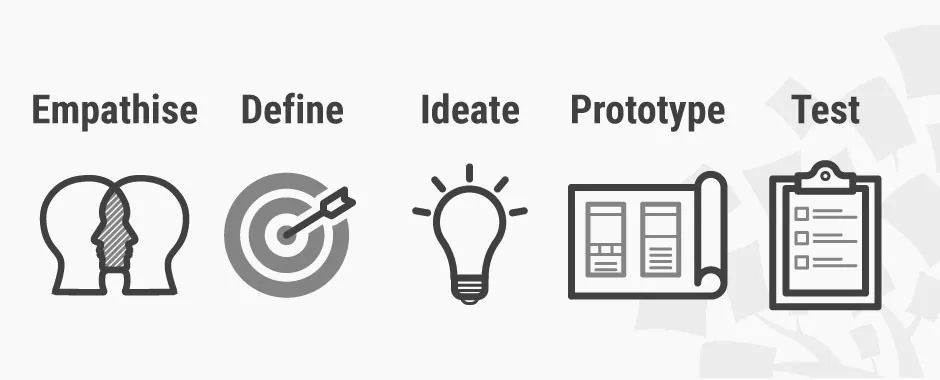
Design thinking follows these five steps (Image Source).
In the case of information design, it’s solving the problem of ‘how do we share this information in a way that’s easy to understand?’ Let’s take a look at a real-world example.
Say your information design project is to design a graphic that focuses on food hygiene safety. Here’s what the five design thinking steps might look like:
Step 1: Empathize
The designer will visit the kitchen where the food prep will happen. They might chat to the kitchen staff about how they typically work, what problems they’re facing, and what they might need from a poster. If it’s not possible to visit the place in person, the designer might do some research either on their own team or with the help of a UX researcher.
Step 2: Define
Next, the designer defines what’s needed using things they learned while chatting to the kitchen staff. With our food hygiene poster example, requirements might include things like lamination so the poster doesn’t crinkle if it gets moist. It should also probably have images rather than words so international workers can understand the message and extra-large diagrams that employees and see from afar.
Step 3: Ideate
Next, the designer (or design team) comes up with ideas that answer the requirements. They’ll also consider things like how best to make sure the poster is clear, attractive, and easy to understand.
Step 4: Prototype
This is the first draft of your design. It’ll be put up in the kitchen as a trial run. The aim of design prototyping is to collect real-world feedback, which is highly important.
Step 5: Test
Is the poster doing its job? There may be metrics to measure here, like a reduction in food poisoning cases, better hygiene scores from local authorities, an increase in hand-washing among staff… and so on. Or perhaps the posters are working but could be improved. For example, non-gloss lamination so glare doesn’t obscure the images. Or perhaps better placement around the kitchen. Once feedback has been shared with the designer, they’ll go back to stage one and refine the posters until they’re as close to answering the brief as possible.
Why is information design important?
Information design makes information interesting, easy to understand, and fun. Unlike data, it draws the viewer in and takes them on a mini-journey. Not only does it help make information easier to digest, but it also makes information more accessible.
- Images or videos instead of words mean non-native speakers, individuals with low or no literacy rates, and those with dyslexia can access valuable information.
- Adding audio or incorporating extra-large fonts into your design can help those with sight problems.
- Turning data into an infographic means information is presented in bite-sized chunks that are easy to understand far quicker than if the reader had to draw conclusions themselves.
Information design best practice
Information design works best when it’s human-centric, accessible for everyone, and beautiful enough to catch the viewer’s attention. Here are some points to bear in mind before you set sail on your own information design journey.
- Design with the core user in mind, and do lots of research to really get under their skin
- Turn your raw data into a story with a clear point
- Don’t skip the prototype stage (this bit gives you lots of important real-world feedback)
- Keep accessibility in mind
- Use hierarchy principles to make sure the flow of information is logical
- Make it attractive
- Make it clear
- Apply Gestalt Principles
Final thoughts
Without information design, the world would be a pretty boring place. Posters and textbooks would just be plain words, data would be bland, differently-abled folks would miss out on important information, and maps would be difficult to understand. Information not only makes things nicer — it also widens access and comprehension.
You don’t have to be a graphic designer to incorporate information design principles into your own work: Diagramming tools allow you to turn data into a story. Cacoo, our own software, comes with templates and editing tools that make it easy to create beautiful, colorful creations in minutes — from wireframes and user story maps that let you plot your user’s needs from start to finish — to infographics and project plans that make it eBay to present complex information in a way that’s clear, easier to comprehend, and last but not least, fun to look at.

