10 must-see wireframe examples to inspire your next design
Georgina Guthrie
February 16, 2022
As any digital designer worth their salt knows, creating a top-notch website goes way beyond picking the perfect color palette and a snappy font. In fact, if you peel back the surface of any good website or app, you’ll find a well-designed wireframe holding the whole thing together.
Why is wireframing important?
There are two main benefits to beginning your design process with a wireframe. Firstly, it separates the design process from UX. This means you can focus on the user journey objectively without the distraction of colors and fonts. And likewise, when working on the aesthetics later, you won’t worry about where to put what and why.
If you’re working with a client, wireframes are also a great way to show off your UX expertise and involve them in the design process early on.
Creating great wireframes isn’t easy, and everyone needs a little inspiration from time to time. So without further ado, here are some of our favorite wireframe examples to fire up your imagination.
1. Simple, hand-drawn wireframe
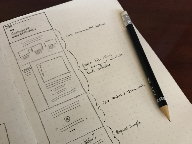
There’s no one right way to begin. Some UX designers create initial sketches on paper or a whiteboard, while others prefer to go straight to digital.
Beginning with a sketch wireframe means you can get started anywhere you have a pen and paper — whether that’s during a meeting or while chatting on the phone with your client. This is a great example of a really simple yet effective hand-drawn, annotated content wireframe from Tim Knight.
2. Low-fidelity wireframe
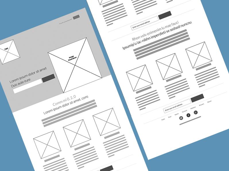
Here’s one of our favorite wireframe examples of how the layout for a startup website will look. Valeria Pivovarova’s low-fidelity design clearly displays each content block. She keeps her design crisp, clear, and simple to ensure the site is as responsive as possible.
3. Wireframe with user journey
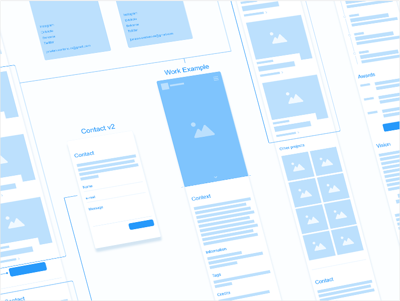
This website wireframe example by Jonathan Centino shows the beginnings of a personal portfolio. We also like how the designer has begun to create a wireframe map showing how the pages relate to one another. The content and user journey are clearly labeled and organized — a task that will save time further down the line.
4. Wireframe with multiple search options
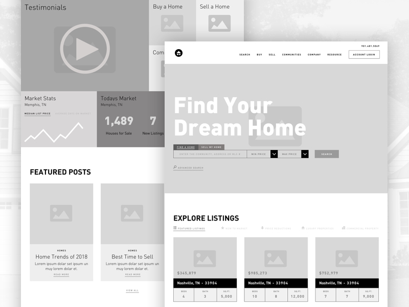
Designer Kira’s website mockup shows off a bold hero with several search options underneath, plus previews to make filtering as easy as possible for the user.
We love how she made all the essential information highly accessible without compromising on style. Notice how the design uses just enough copy to explain the purpose of the page.
5. Detailed, hand-drawn wireframe
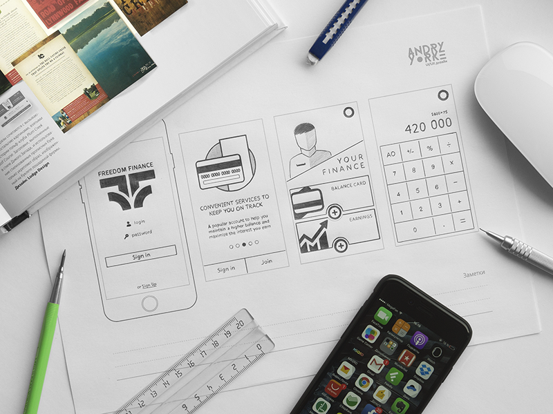
There’s a lot to be said for keeping the design process offline. Settling down with a good old-fashioned pen, paper, and ruler will keep your attention focused on the task at hand. And it’s a great way to escape distracting emails or notifications.
Andry Yorke’s smart wireframe examples show a more detailed mobile app wireframe mockup sketch. This one is for a finance app with iPhone wireframes.
6. High-fidelity wireframe

This oh-so slick high-fidelity wireframe example from JT Grauke uses lashings of white space to give a contemporary, minimalist feel while showing layout and type hierarchy.
7. Hi-fi interactive wireframe
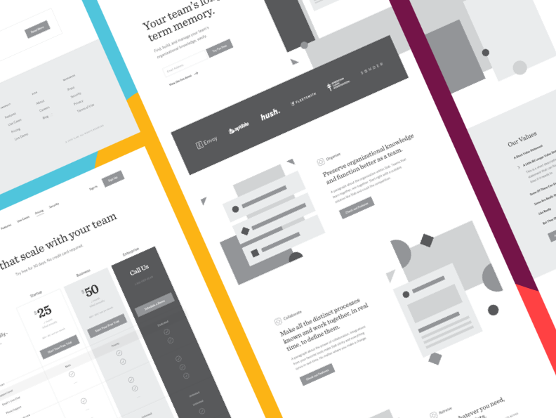
We couldn’t resist including this hi-fi interactive wireframe example from JT Grauke, which ingeniously uses simple shapes and a splash of color to bring the mockup to life. The designer’s take:
“Instead of moving from a content brief to visual design, we first made low-fidelity wires. This allowed us to make sure the overall storytelling was right and matched content strategy. Now, in these high-fidelity wires, we’re making more decisions about layout and hierarchy.
But there’s still more work to be done to flesh out the visual style. It’s been an incredible process because it’s allowed us to break down the myriad of design decisions, that would normally be made at once, more slowly over a longer period of time via different stages of design and fidelity.”
8. Wireframe GIF of each step

From low-fi to hi-fi to finished. We love this wireframe GIF by Marko Peric, which shows the whole process in action — from those initial rough content sketches right through to the fully-designed app site, complete with photos, fonts, and colors. Peric’s clever graphic is proof that well-thought-out wireframe examples really are the secret to a great product design.
9. Pre-plan infographics
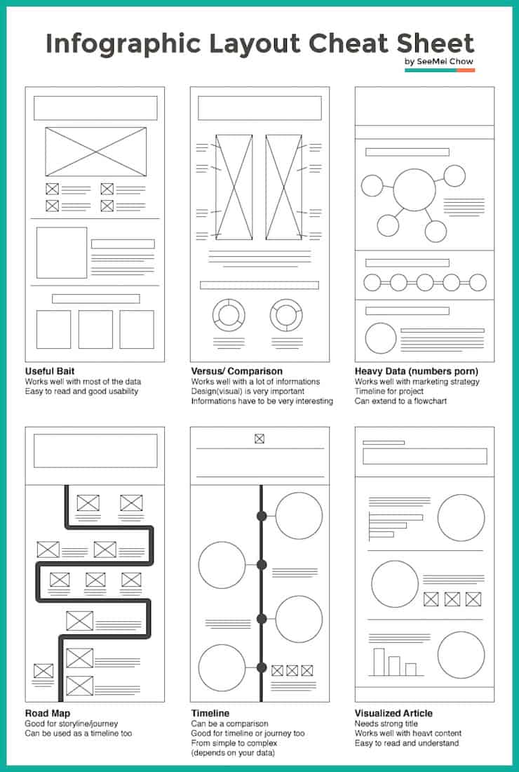
NeoMam Studios makes a great point in putting together that a site with great infographics will always get noticed. Pre-planning to insert visualizations into your wireframe will ensure that you have them in a spot where they can do as much heavy lifting as possible when combined with the copy you might not have yet.
10. Creating mobile and desktop versions

With ever-evolving media practices, it is most common that when you put together a wireframe, it isn’t going to be on just one platform. Brandon Davis developed a terrific example of creating both mobile and desktop versions simultaneously. Doing this makes sure that both versions communicate the same information while leveraging best practices for each.
Here you can see a great mobile wireframe paired with a desktop wireframe.
How to improve your wireframing skills
Now that you’ve seen some inspiring wireframe examples, we hope your next step is to polish up your design portfolio. Wireframing pushes you to analyze a design on multiple levels, taking into account the basic functionality, the user journey, and the cognitive experience. If you want to create better websites and apps, start by refining your wireframing skills.
1. Use relevant sample data
Wireframing without a clear end-user or well-defined task in mind is a waste of time. At some point, you’ll probably have stakeholders who want to see something visual to get a sense of direction, but that isn’t how the design process is supposed to work.
Ask questions to better understand the purpose of the product, the calls to action, and the typical user. While the wireframing process is iterative in nature, working without relevant data adds unnecessary steps. Data also helps you justify your design decisions and keep everyone focused on the product goal, so they don’t get caught up on aesthetics.
2. Make the user flow as simple as possible
Whether you look at it from a consumer or business perspective, a streamlined user flow benefits everyone. As a consumer, it’s frustrating to deal with sites that lead you in circles and overcomplicate what should be a simple process. And businesses that add extra steps and obstacles in the user path will sink their conversion rates.
So, as you develop the page flow, think about the simplest route a user can take to complete an action, get an answer, or solve a problem. What are the thought processes of a typical user, and how will the pages work together to serve their needs? Use your data to understand how to prioritize the content layout. The most important components should be easy to reach on the main pages of your site or app.
3. Use a grid or template as a framework
Wireframe templates and grids make it easy to organize content placeholders and balance your available space. Both options encourage you to focus entirely on structure and functionality first. Not to mention, you can rapidly come up with a clean content hierarchy that’s easy to adjust or scale in later iterations.
4. Create reusable elements
One way to keep things consistent (and save time) is to create a library of page elements you can duplicate. This allows you to work faster and make sure items like buttons or content placeholders are completely uniform.
5. Get ongoing feedback
Whether working on a client project or practice design, you should continually seek feedback to improve your designs. Even when you have significant data and a clear objective, you could overlook aspects of the user flow that aren’t as straightforward and intuitive as you thought. Communicating with stakeholders will help you get different perspectives and create a design that serves your diverse user base well.
If you’re making designs just to beef up your portfolio, this is where a design forum or online community comes in handy. By sharing your wireframe examples with other professionals, you can get helpful advice from people who have worked on a wide range of projects.
Final thoughts
As with all creative projects, proper preparation is key to creating a solid wireframe.
Before you even pick up a pencil or stylus, gather as much information from the client as possible. It’s also a good idea to set down a defined way to measure feedback that covers your website or app’s key areas and functions. Once you’ve got that ticked off your list, you’re ready to pick up your tools.
And finally, remember to choose wireframe software that lets you easily create diagrams you can share with team members and clients. They’ll appreciate the early involvement and ultimately be happier with the final result.
This post was originally published on October 15, 2018, and updated most recently on February 16, 2022.

